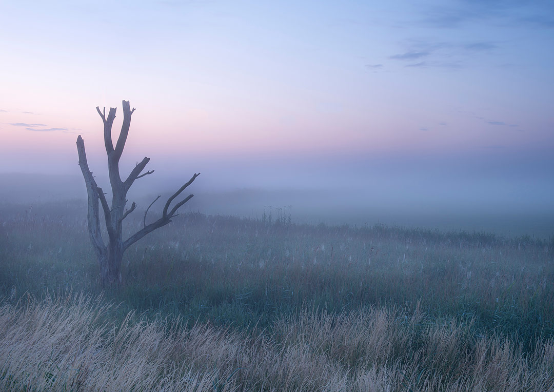
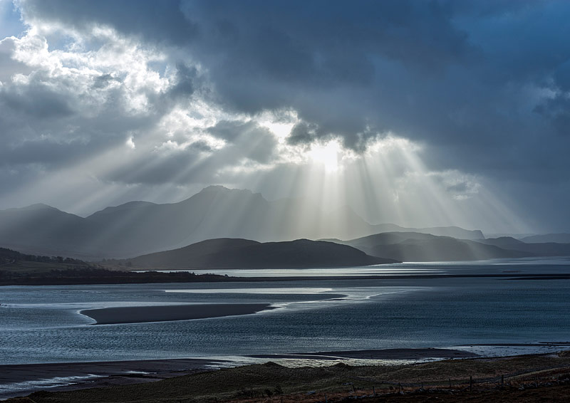
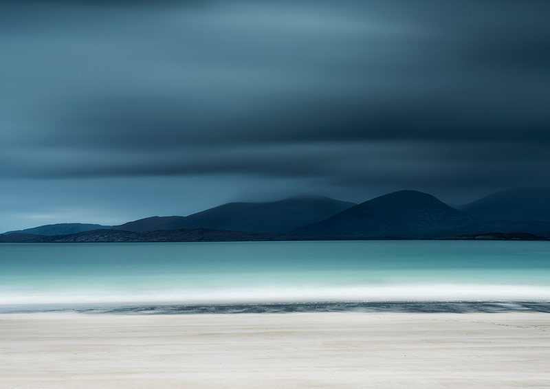
Once the gallery confirms the space and dates, the work begins, sometimes nearly a year before the actual exhibition. Although my exhibition’s title was Elemental, it was far from elemental if you are going to create a visual display that captures the interest of many rather than the few.
Before selecting the pictures, work needs to take place around the theme. For me, Elemental meant selecting and shooting landscape photographs that focused on the interplay between the elements as they transformed the landscape. The photographs needed to show how the elements influence not only the physicality of the landscape but also our emotional response to it.
Once this was decided, I needed to plan how the elements – earth, air, water and so on – would be featured in the photographs and how they would complement and coexist with one another in the gallery. Visiting the space many times is essential if your work is going to look polished and professional. Not all galleries cater to all types of work, so deciding how the photographs are going to be displayed before you select them is essential.
We all know that photography is about light; the importance of this cannot be over-emphasised. We are not just recording objects such as trees, beaches, mountains and so on. Instead, we record how lines, forms, and textures interact with one another and how light reveals these compositional elements. We choose these compositions and expose the scene according to how we interpret it. Each one of us will do this differently. So, in selecting the photographs for the exhibition, I had to ensure the theme was adhered to, as well as choosing the photographs that directed the viewer’s attention due to the interplay of light and form. It is essential to analyse the distribution of light within the photograph before printing. The areas that have too much contrast or too much light often direct the viewer away from the main focus of the photograph. Making notes on each photograph before it reaches the print stage really does help you pinpoint what you want to achieve in the final print. I use the word final as printing a good photograph often takes more than one print if you want to emphasise certain features or details. Looking at the print over time also helps you to spot flaws or areas you wish to change or improve. All of the photographs I selected for the exhibition were in colour, not because I dislike black and white but because I felt that mixing the two genres presented difficulties for curation and the viewer. The next stage after selecting the photographs is to process them.
We all process images using a variety of techniques and software. I prefer Camera Raw and Photoshop CC. I tend not to use presets as I think that each landscape photograph is individual and requires processing accordingly. I am also not a great fan of set styles. There will be many who disagree with me, but creating and maintaining one style limits creativity and creates a portfolio of images that look mostly the same. I do favour particular types of photography, such as sea and coastal, but that is really as far as it goes. Because of this, the selection of photographs prior to processing and printing is essential if you are going to maintain some sort of congruence and continuity within the exhibition that holds the viewers’ attention and moves them on to the next photograph and isn’t merely a set of photographs that you have selected randomly.
Each photograph selected was processed again in relation to the theme of the exhibition and in relation to the size of the photograph, even if I had previously carried out some processing on it. Nearly all of the prints were A3 plus or A2, with a few 8 by 8 inches square for a particular part of the gallery.
Processing and printing in colour required me to consider the intensities of colour in the frame, along with saturation and contrast, to make the photograph say what I wanted to say. In other words, which emotions did I want to convey through the photographs and the use of colour within them – mystery, optimism, serenity, joy, inspiration and so on? A colour wheel can help you with this task – there are many available on the web.
All photographers who process their own work know the basics of a workflow, so I will not bore you with them except for three aspects.
1) Ensuring there are no sensor marks on the negative
2) Getting the blacks and whites correct within the image
3) Making sure there is no chromatic aberration
After the basics are complete, the next stage is to use curves and masks within Photoshop cc. I use curves and masks as they offer endless possibilities to refine a print. For example, I can brighten or darken parts of the image so that the tonal balance is correct, add or alter saturation and contrast, select parts of the image to work on, and then use a curve to alter and adjust. I use the blend mode luminosity mainly as it is subtler, whereas the blend mode usually affects the hue saturation and luminosity. Finally, I sharpen using raw and smart sharpen.
Printing on a professional Epson printer linked to an iMac guarantees a quality print if the processing is correct and the screen is calibrated correctly. It does not, however, necessarily mean you will get the print you want, so live with the print for a few days before deciding if you want to work on it any further. The choice of paper is also important, and for me, it is Permajet FB satin 310g and FB Matt 285g. It is intensely satisfying to see your print finally emerge from the printer looking exactly as you want it to! This is the real joy of photography, after all: seeing the final product in a large print.
Once you have all your prints ready and collated for framing, the decision as to how to frame enters the scene. My choices are an Arqadia museum off-white mount board with a 1.5-inch black frame, plus a version of True Vue glass that does not reduce clarity or sharpness but does minimise reflections from various lighting sources.
Finally, you have the advertising and marketing, organising the private view, printing your postcards, ensuring your labels are printed on quality mount board in a set style, writing your artist statement and, of course, hanging the photographs to display them at their very best. If and when you have all this done, you just hope that people will come and enjoy your work.


3 Comments
Thanks for the tips!
Thank you for the helpful insights. How many prints did you display in your exhibition?
Very striking images.