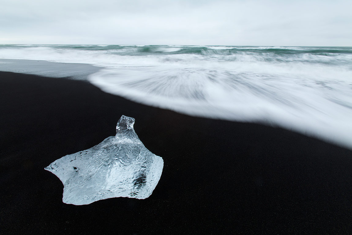
When faced with a glorious landscape the natural inclination can be to cram as much of it into the frame as possible, to try to encapsulate all that you can see into a single picture. The trouble with this approach is that the two-dimensional aspect of the digital image is unable to truly decipher and replicate the image that your eyes and brain are able to process and see. What your eyes see as an intricate landscape full of depth, is often reduced to a cluttered scene where many of the main features become insignificant and lost.
An alternative approach to big view landscapes is to adopt a philosophy of ‘less is more’. By stripping the landscape down to the bare minimum of just one or two key elements, it is possible to create very strong images that have a powerful graphic quality. This kind of minimalist images can say as much about a landscape as the wider view and can evoke equal, if not stronger emotions to the viewer.
By definition a minimalist photograph has very few elements in it – it is simple and clean. The composition of the image ensures that all the attention is focused on the subject – usually a single focal point – and that any other elements in the landscape that may otherwise be distracting are cropped and left out of the picture.
The overriding idea behind a minimalist image is to convey a scene as effectively as possible using a minimum number of components such as shape, colour, texture and line. To achieve this, the elements that are included in the composition have to ...
Upon payment completion a yellow banner will display (Thank you. Your purchase has been approved – Please click here to proceed). That link will transfer you to a page where you can access the entire article. You will also receive an email with a link to access the article page.


