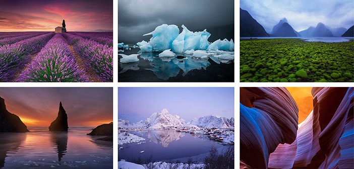
 The elegance of colour
I often use the Editor’s letter to invite you, our readers, to send us your images or article ideas for potential publication in the magazine. Each month we are pleased that so many do and, since LPM was first launched, many hundreds of you have had your first image published, your first article commissioned, or your first portfolio showcased.
Landscape Photography Magazine exists to support and promote your craft and we have a variety of sections in the magazine that accommodate the good images, as well as the exceptional images, in colour and in monochrome.
The mention of colour brings me nicely to the subject of this month’s letter. How many of you will remember the Fujifilm Velvia film and its vibrant colour palette, especially designed for landscape photography? Its colours were rich, vibrant, yet truly representative of nature. How could anyone not love them?
Each month, the majority of images we receive look glorious, with their colours superbly displayed. Yet, some of us have a definite tendency to ‘oversaturate’ our images. In some cases, this can be due to incorrectly calibrated computer screens. In others, an intentional boost of the processing software saturation slider.
So, how much colour is too much? It is very easy to start pushing a slider, but it is much harder to judge when to stop. While oversaturated images might impress viewers temporarily, it has always been my belief that an image with vibrant, yet natural colour will be viewed and appreciated for much longer. My advice? If in doubt, take your time, revisit the image until you are happy and seek the honest opinion of someone you trust.
Dimitri Vasileiou, Editor of LPM
[email protected]


